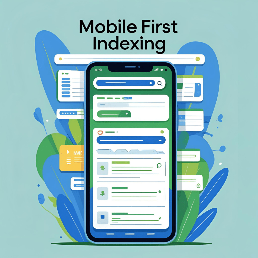
Mobile First Indexing
Mobile First Indexing:
A Comprehensive Guide for 2025 and Beyond
The digital landscape has undergone a dramatic transformation over the past decade. Smartphones and tablets have become the primary gateways to the internet for billions of users worldwide. In response to this shift in user behavior, Google introduced a game-changing concept: Mobile First Indexing.
In this in-depth guide, we’ll explore what mobile-first indexing means, why it matters, how it impacts SEO, and what website owners must do to remain competitive in this mobile-centric world. Whether you’re a website developer, business owner, or digital marketer, understanding and adapting to mobile-first indexing is no longer optional—it’s essential.
Table of Contents
- What Is Mobile First Indexing?
- Evolution of Indexing: From Desktop to Mobile-First
- How Mobile First Indexing Works
- Why Mobile First Indexing Matters
- Impact of Mobile First Indexing on SEO
- Key Mobile Optimization Factors
- Mobile vs Desktop: How to Align Content
- Common Mistakes in Mobile First Indexing
- Tools to Test Mobile-Friendliness
- Best Practices for Mobile-First Optimization
- Future of Mobile First Indexing
- Conclusion
1. What Is Mobile First Indexing?
Mobile-first indexing means that Google predominantly uses the mobile version of the content for indexing and ranking in search results. Previously, Google used the desktop version of a page’s content to evaluate relevance to a user’s query.
This shift reflects a fundamental reality: more than 60% of searches now happen on mobile devices, and that percentage is growing.
Key Takeaway:
With mobile-first indexing, your mobile site becomes the primary source for Google Search—not a secondary or alternate version.
2. Evolution of Indexing: From Desktop to Mobile-First
Before 2016:
Google’s crawler prioritized desktop content. Mobile sites were treated as secondary or complementary.
2016 – Google Announces Mobile-First Testing:
In response to the rise in mobile users, Google began experimenting with mobile-first indexing.
2018 – Mobile-First Indexing by Default:
New websites began being indexed mobile-first by default.
2021 – Broad Rollout Complete:
Most websites are now indexed using mobile-first criteria.
2024 and Beyond:
Mobile-first is no longer a trend—it’s the standard.
3. How Mobile First Indexing Works
Google uses Googlebot Smartphone to crawl and render pages. It checks for:
- Mobile usability
- Content parity between mobile and desktop
- Page speed and loading performance
- Structured data availability
- Meta tags and canonical links
If a site serves different content on mobile and desktop, the mobile version will determine ranking, not the desktop version.
4. Why Mobile First Indexing Matters
a. User Experience Alignment
Since users search mostly via mobile devices, showing mobile-friendly results creates a better user experience.
b. SEO and Rankings
Websites not optimized for mobile may suffer in rankings due to poor usability, slow load times, or missing content.
c. Increased Crawling Efficiency
Using a single mobile-first index streamlines crawling and indexing, reducing resource load on Google and improving consistency.
5. Impact of Mobile First Indexing on SEO
✅ Content Visibility
If content is only available on desktop, it won’t be indexed if your site is mobile-first.
✅ Structured Data
Only structured data present on mobile pages is considered. Missing markup = lost enhancements in search.
✅ Page Speed
Page load time and interactivity on mobile significantly influence rankings, especially under Core Web Vitals.
✅ Canonical Tags
Both mobile and desktop versions should reference the same canonical URL, or Google may index the wrong version.
✅ Link Equity
Internal linking and backlinks pointing to mobile content matter just as much as desktop.
6. Key Mobile Optimization Factors
To succeed in mobile-first indexing, your site must meet the following criteria:
1. Responsive Design
Use CSS media queries and flexible layouts that adapt to all screen sizes.
2. Content Consistency
Ensure that all text, images, videos, and structured data are identical or equivalent between mobile and desktop.
3. Mobile Usability
Check for:
- Touch-friendly buttons
- Readable fonts
- No horizontal scrolling
- Minimal popups
4. Page Load Speed
Use lightweight assets, lazy loading, image compression, and caching.
5. Structured Data
Ensure schema markup exists on both mobile and desktop versions.
6. Meta Tags
Use consistent <title> and <meta description> tags across both versions.
7. Mobile vs Desktop: How to Align Content
Use Responsive Web Design (RWD)
Avoid maintaining separate URLs for mobile (e.g., m.example.com). Instead, make your content fluid across all devices.
Unified URL Structure
Responsive sites use one URL for all devices, simplifying SEO and canonicalization.
Ensure Content Parity
Don’t hide important content on mobile to improve speed. Google ranks what it can see and index.
Equal Structured Data and Alt Tags
Ensure mobile versions of pages carry the same JSON-LD and alt descriptions.
8. Common Mistakes in Mobile First Indexing
❌ Separate URLs with Different Content
Having mobile and desktop versions with differing content can harm your SEO.
❌ Hiding Content with Tabs or Accordions
Google now understands hidden elements, but excessive concealment can still reduce visibility.
❌ Missing Structured Data on Mobile
This can result in the loss of rich snippets in search results.
❌ Using “Disallow” in Robots.txt for Mobile
Blocking mobile user-agents prevents Googlebot Smartphone from indexing your content.
❌ Slow Mobile Sites
Even if your content is top-tier, slow loading on mobile kills rankings and UX.
9. Tools to Test Mobile-Friendliness
✅ Google Mobile Friendly Test
https://search.google.com/test/mobile-friendly
Checks usability, viewport configuration, font sizes, touch elements, etc.
✅ Google Search Console – Mobile Usability Report
Identifies errors such as clickable elements being too close or content being wider than the screen.
✅ Lighthouse & PageSpeed Insights
Assess performance, accessibility, and SEO for mobile users.
✅ Chrome DevTools – Device Emulation
Simulate mobile viewports and test layout responsiveness.
10. Best Practices for Mobile-First Optimization
✅ Adopt a Mobile-First Design Strategy
Design for small screens first, then scale up.
✅ Optimize Images and Videos
Use:
srcsetfor responsive images- WebP format for compression
- Lazy loading for faster rendering
✅ Prioritize Core Web Vitals
Key metrics to optimize:
- LCP (Largest Contentful Paint): <2.5 seconds
- FID (First Input Delay): <100ms
- CLS (Cumulative Layout Shift): <0.1
✅ Avoid Intrusive Interstitials
Pop-ups that block content harm UX and rankings.
✅ Focus on Navigation Simplicity
Use sticky headers, collapsible menus, and intuitive layout.
✅ Enable Browser Caching
Store static files on a user’s device to reduce repeat load times.
11. The Future of Mobile First Indexing
Mobile-Only Index?
In the future, Google may shift toward a mobile-only index, where desktop versions are completely disregarded.
AI-Driven Search
With the rise of voice search and AI assistants (like SGE), mobile optimization goes beyond layout—context and speed are key.
Web Accessibility and PWA
Progressive Web Apps (PWAs) and accessible, fast mobile design will define SERP leaders.
Core Web Vitals as Ranking Metrics
Google’s increased reliance on page experience signals means mobile-first performance will be a primary SEO differentiator.
12. Conclusion
Mobile first indexing is not just an algorithm change—it’s a reflection of how people use the internet today. To stay relevant, websites must adapt by embracing responsive design, mobile usability, performance optimization, and content parity.
Neglecting mobile-first principles can result in lost visibility, reduced traffic, and poor user engagement. On the other hand, optimizing for mobile-first indexing gives your website the competitive edge it needs in the mobile era.
The future of search is mobile—and mobile-first is the foundation of that future.